Arts 3703 Final Project: “A Sense of Place”
This was the assignment with which I had the most trouble, but the problems were almost entirely conceptual. I either had ideas too large for three weeks of shooting or they refused to jell. If you’re interested you could ask, but most people would rather hear dick jokes from me.
This project covers the streets that I travel every day. My new neighborhood is the dangerous and urban Minneapolis I’d wanted when I moved to Minnesota from Iowa almost twenty years ago. This concrete landscape is a home on another planet. Will these sights survive the encroaching gentrification upon whose wave I am riding?
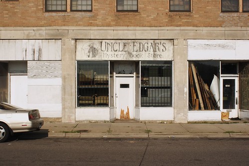
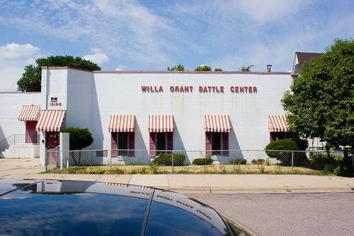
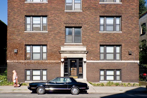
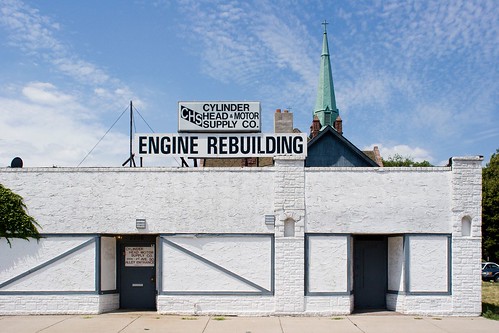

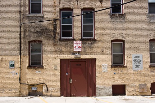
Seriously, I love these. Cars or hints of cars in each one. Weird symmetry. Pink Muslim ladies. They’re great images.
The first one is my favorite. Now THAT is what a mystery book store should look like.
Nice overall. Whenever I look at one, though, it looks too far away somehow. I’m not able to completely connect with it. It’s like there’s too much other stuff in the frame. Maybe it’s the flat face-on angle. I’m not a photography wiz, but I do feel like I’m only just barely not really connecting. You know?
The third-to-last speaks to me best. It’s cramped but in a large space. That says something.
Tim, these ARE a bit smaller than the prints. I was taking into consideration the larger format and the corresponding ability to carry more information — you can make a physically larger image denser. That’s one of the things that I’ve been thinking about a lot lately: if my target is a 400 pixel image on my web site, I will unconsciously include less in the image. The engine rebuilding image probably works for that reason. There is just less crammed in to the shot.
Thank you for the comment! It gives me a chance to explain what I’ve done and see if those thoughts make sense to anyone else.
I like the broad views. They would be perfect backdrops for colorforms. Do they sell sets with hookers, homeless people and shopping carts? That would be awesome.